
Feature Integration
I led the design of Android and iOS App. I translated the web features for App users providing an ubiquitous experience in each product of Pepper Multi-Platform.
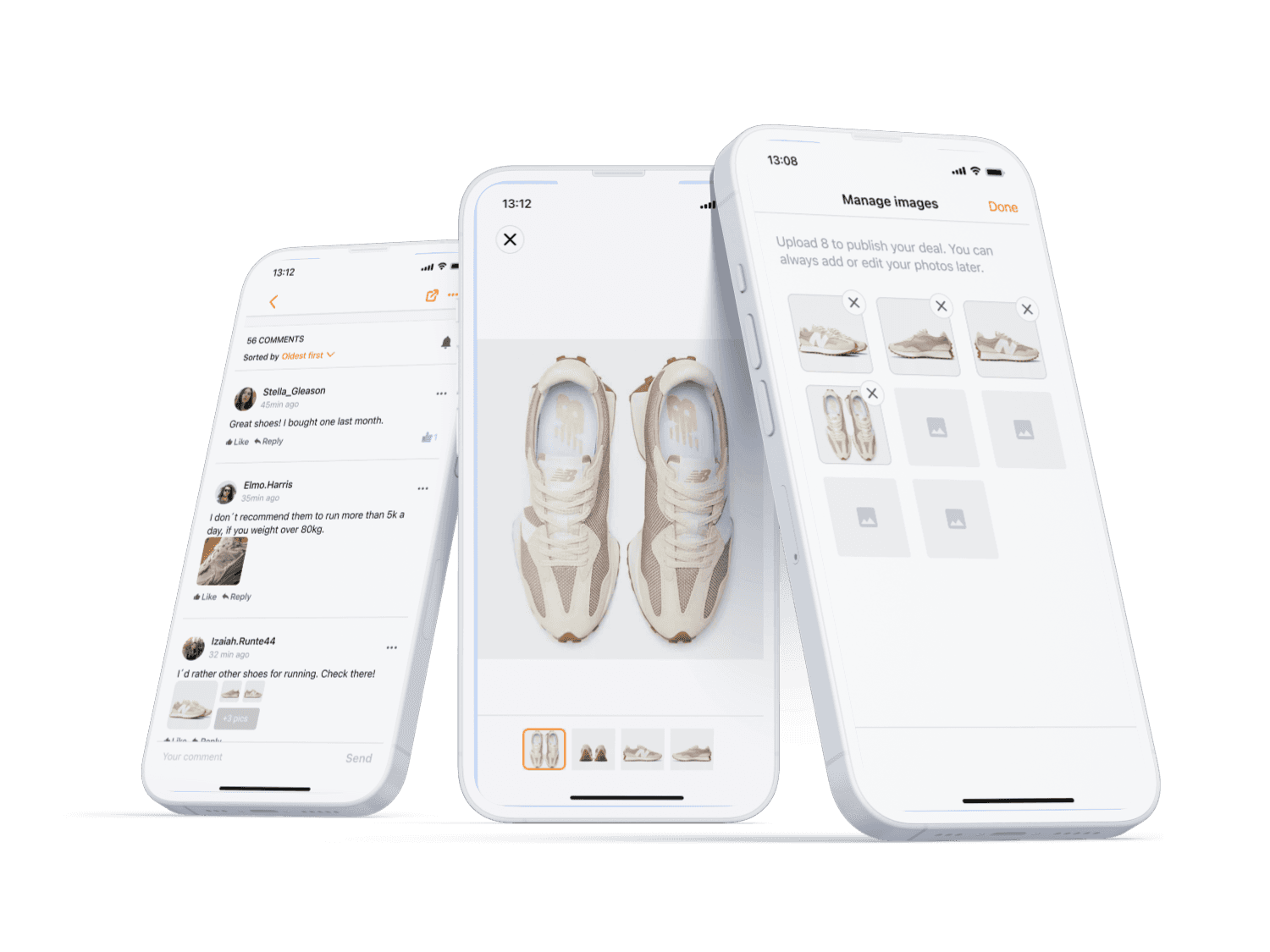
The gallery allows the community member to access and consume easier images shared from their peers. It ensures a higher engagement of users with the content on the product page.
Product
Pepper Apps
Timeline
Q3 2021 - Q2 2022


Problem Statement
Native Apps are an underrated business tool to increase your user retention and engagement. Indeed 88% of consumers trust online reviews as much as personal recommendations (source).
In order to promote memorability, companies struggle recreating the same browser experience on Apps. Unless many design patterns are very similar, each system has a dedicated set of tokens and components, because they rely on framework capability.
On the other side the Apps guarantee a higher performance than their web counterpart because they run smoothly on the device. They also have specific features like the dark modes and support native gestures and features.
The following case study is an example of a typical app design project, and it doesn´t reflect exactly the Pepper workflow I was part of during my past experience. I intentionally omitted some details that should not reduce your ability to evaluate my skills in the matter of Native app design.
Research
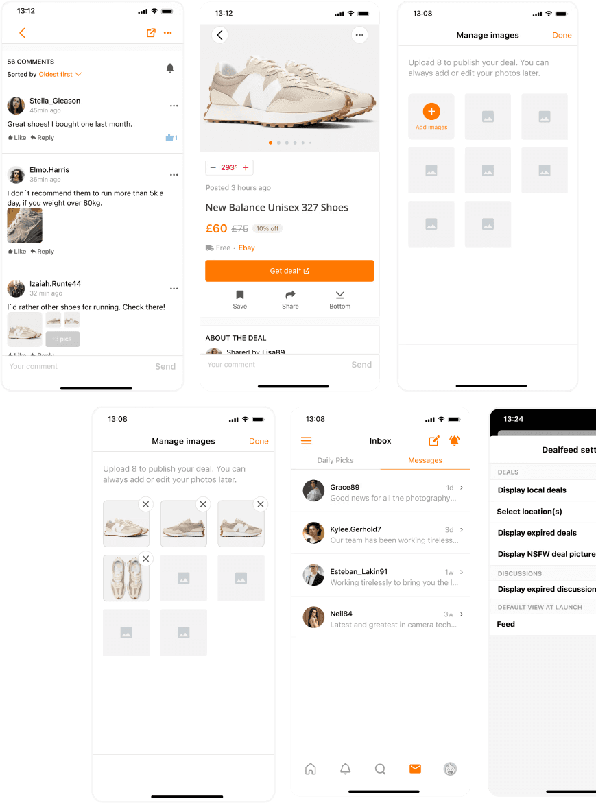
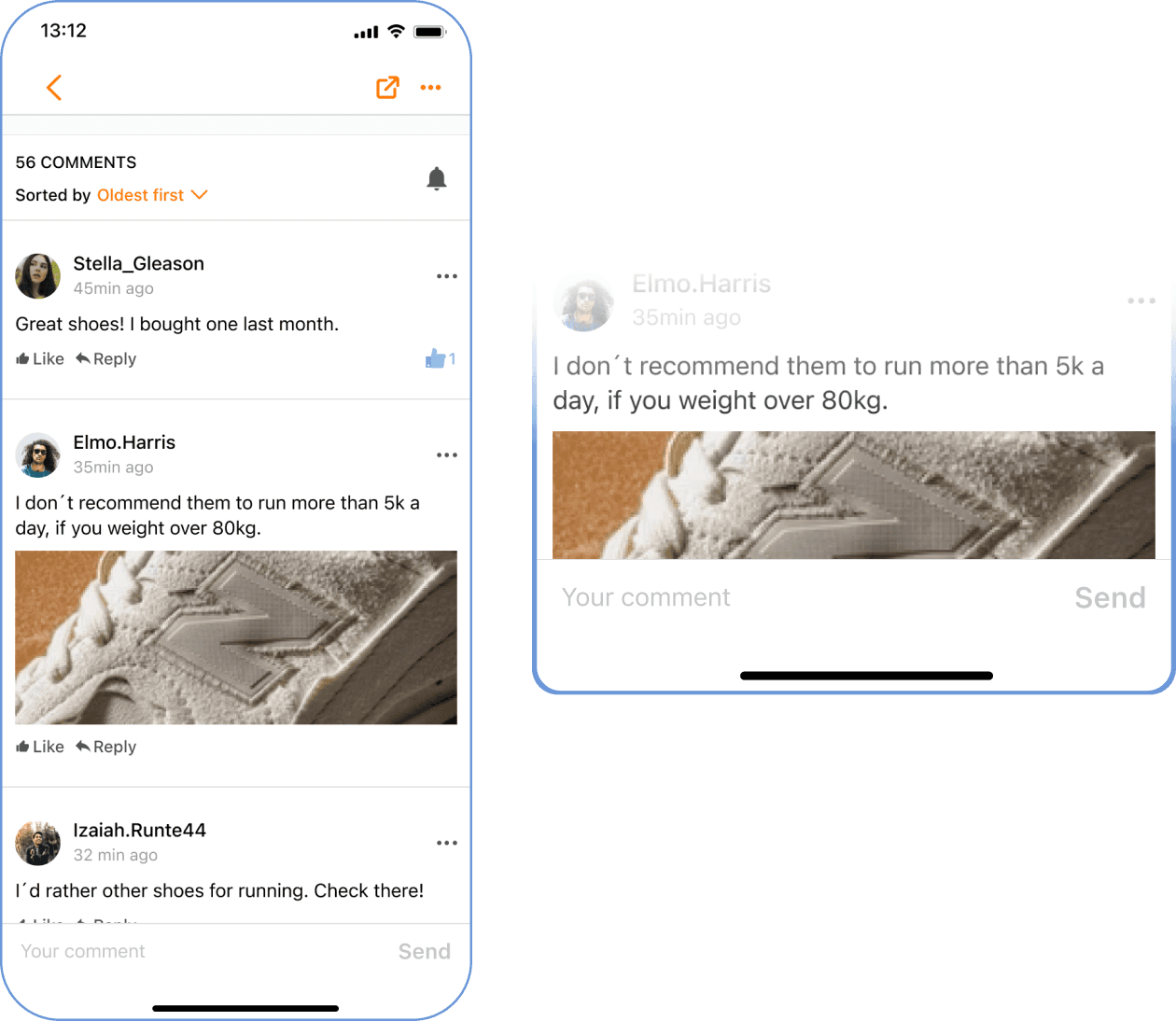
The comment section is a place where the community members share their opinions and experiences with the product or/and merchant described on the deal. Taking in consideration previous research and the usage rate, the community members love to share pictures of their products.
Analogous Research reveals the most common Design Trend for the image gallery and the image uploader.

Size of the picture made the comment card too large for small screens.
Solution
Both Image Gallery and Image Uploader facilitate and encourage our users to interact and consume the content on the Product Page.

A shared component
The Image Thumbnail created for the project is a reusable component for different part of the Pepper Apps.


Web and Android icons rely on the Google Fonts Library, and dark modes have been taken into consideration in the interest to ensure the appropriate token for both modes on App.
Native Gestures
One of the most exciting steps for me was the mapping of native gestures. We wanted to offer our user the chance to emulate the navigation of the default gallery app of the device.

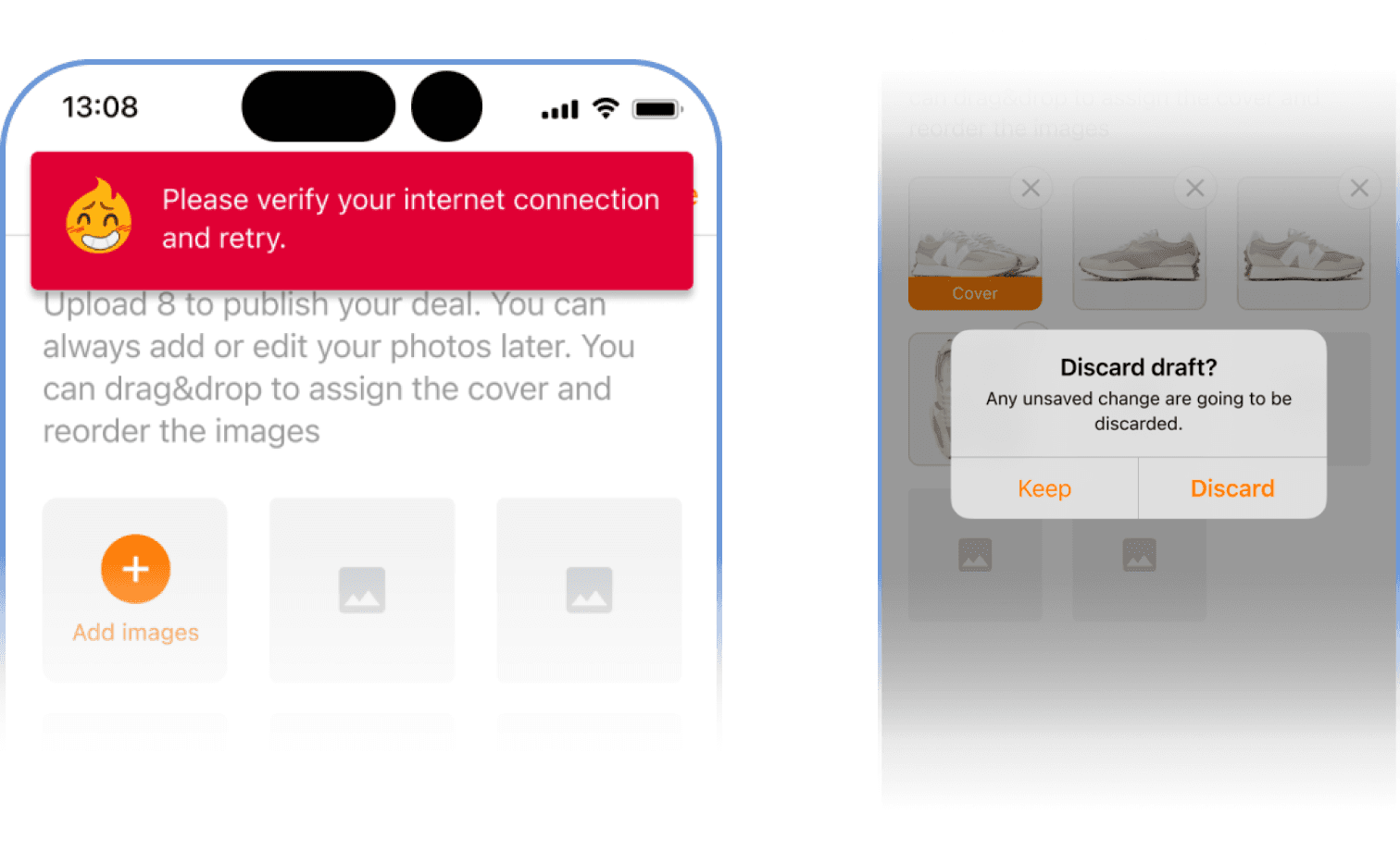
Error message
We reused common design patterns and native components to address those scenarios. For instance, if the user tries to go back without submitting the comment, we display a dialog (called Alert on iOS) in the editor mode.
Thumbnail Grid
The thumbnail grid offers plenty of interactions. The user can play with the images as he wish:
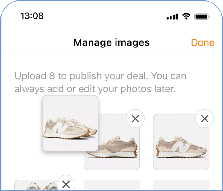
• Tapping on an image opens the image gallery.
• Dragging an image changes the order.
• Tapping the cross icon deletes the image.
Learnings
Technical capability
Each framework has its own technical specifications, and it doesn't matter how much we try to bend them to our will, some shapes of the experience are simply different. App developers supported me spotting edge cases and all types of technical error they could imagine, and advocate for their framework specific features.
Prioritisation
There are many cases to cover but at the end we invest our resources only on most commons.
Collaboration is the real strength
In our continuously changing environment, having great teammates ready to share their knowledge and feedback is the most valuable asset for success.