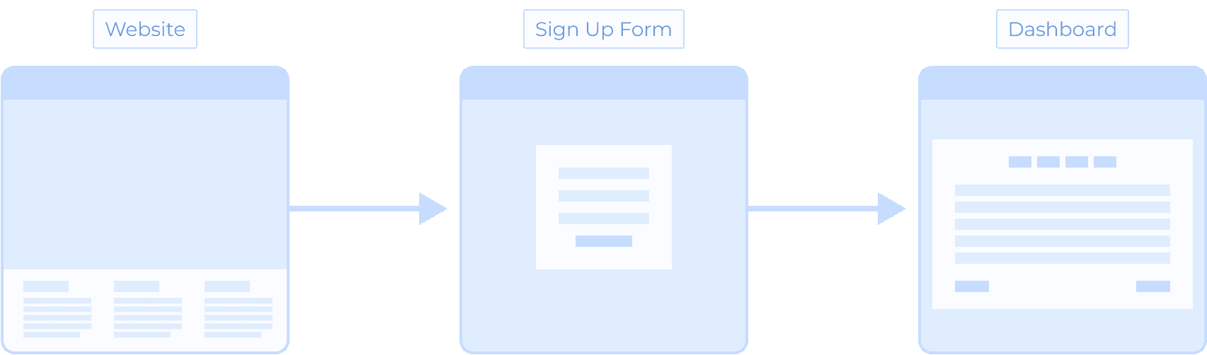
Two Steps Sign-up Form
An online lender wanted to save the cost of the application process. We introduced a two step-form, reducing significantly (-30%) of the unqualified applications, and benefitting our reaction time.
As a UX/UI Designer, I designed a compelling experience to prevent a candidate's mistakes, and accommodate the critical information.
Product
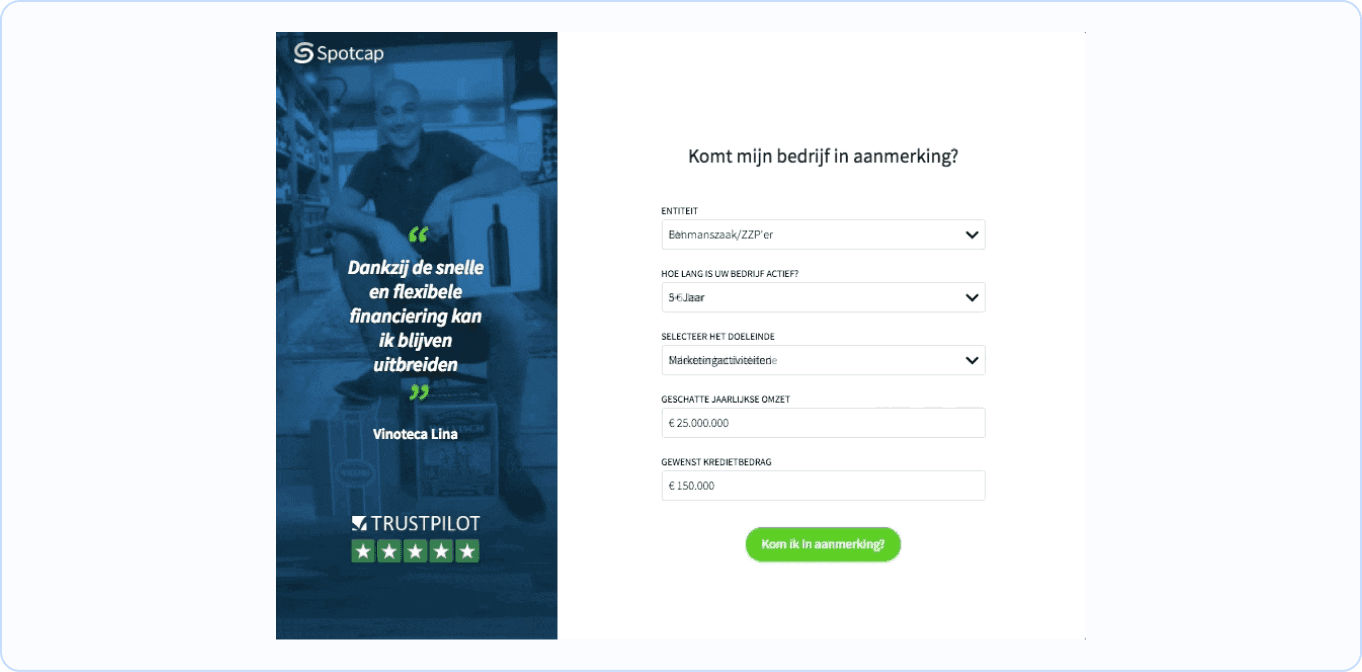
Spotcap Website
Timeline
Q1 2019 - Q2 2019


Problem Statement
Our online lender received on average 120 direct applications weekly through the website form. Unfortunately more than half (72%) of applications are: unqualified, spam or fake.
Cluster the applications were partially automated. Finding an eligible candidate required an extra effort because they also often missed to add a tiny detail decisive for their eligibility.
As a result, the business was negatively affected by consuming unnecessary resources looking for the next client.
Research
Previous Research Insights
Result of an mvp deployed in Netherland 3 months before, it showed a reduction of 10% of unqualified applications: the feature had a high adoption rate and ROI.
Accounting Partner Reports
⅓ of candidates declared they dropped the application because of multiple errors displayed at the same time.
Poor Mobile Experience:
High bounce rate because of using inappropriate design patterns: neglecting minimum touch target area; information overload.

Solution
The new form is the first filter to assign the candidate eligibility and collects the relevant information.
Thanks to the implementation we were able to identify earlier unqualified applications and spams. As result we positively affected the reaction time.

Form States
I customised the Spotcap Form Field adapting the states and appearance described on Google M2 guidelines.


Holding back the user
The candidate can not continue to another field, if he didn't solve the current error. In the same way he can not submit the first step.
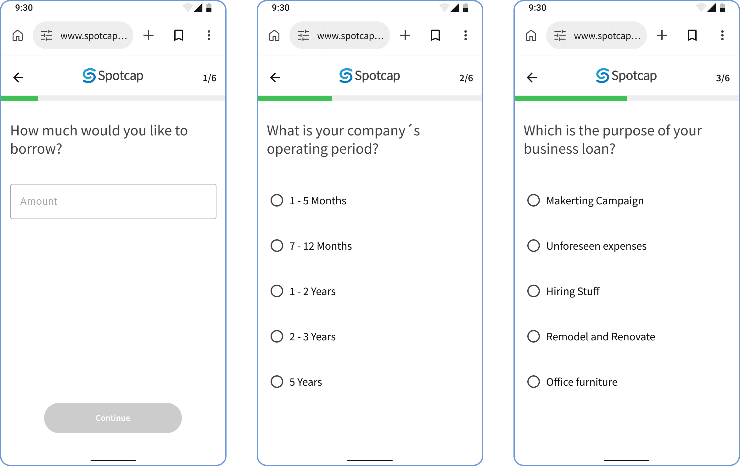
Mobile Version
We iterated a different idea for mobile: we splitted the original fields of the first part in multiple steps.
Learnings
Missed occasion
Unfortunately the stakeholders didn´t decide to implement the mobile version, unless I presented the issue of handling the mobile as desktop. Next time I would build a better argumentation.
Be on the same page
Clear communication is critical for the success of any project.
