Website Optimisation
I led the UX Research for a FinTech Website defining and aligning a UX strategy, based on a data-drive approach.
Our effort positively affects different metrics across four countries: visits, time on page, bounce rate, conversation rate.
Product
Spotcap Website
Timeline
Q1 2019 - Q2 20219


Problem Statement
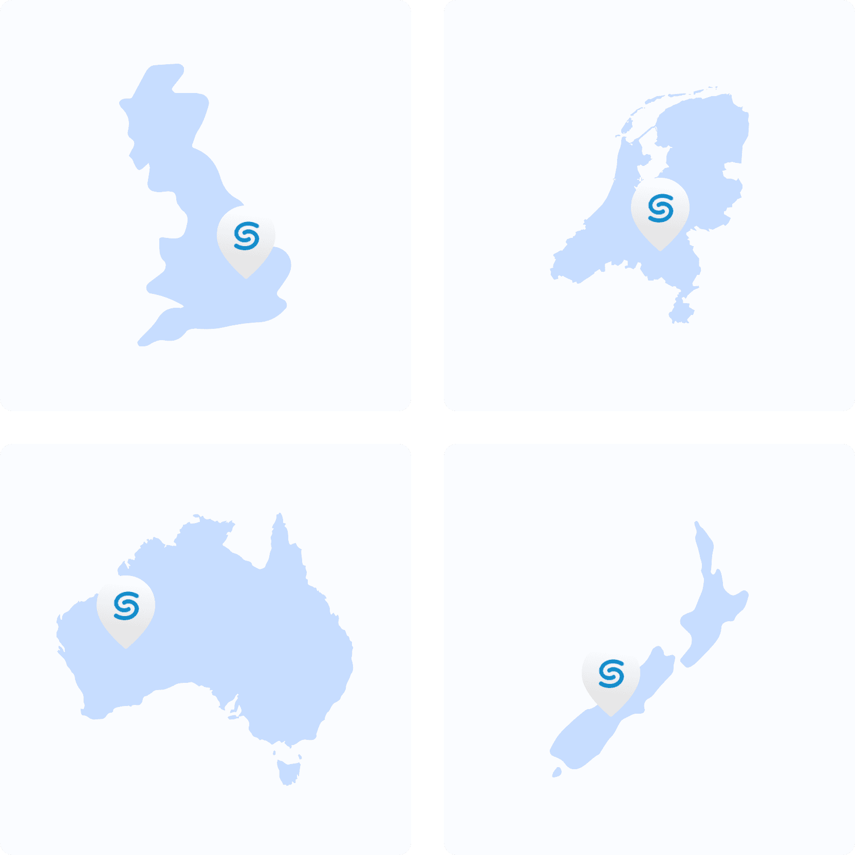
Until the end of 2019 Spotcap operated as a direct lender in four different countries.
Each country had a dedicated marketing team and generated specific content. The marketing teams were responsible for developing creative marketing campaigns and strategies to promote Spotcap's services. They also managed the company's online presence.
Unfortunately, they didn't share a common UX strategy. As a result, the user experience generated was inconsistent in design, navigation, and functionality, which could lead to a lack of brand coherence and trust among customers, ultimately impacting Spotcap's reputation and hindering its growth potential.
The challenge
Before starting, we defined and agreed with the MarketingOPS team which metrics should be relevant to our business objectives, easy to understand and measurable. We picked up which tools and methods to use for building our insights, and to look for patterns.
Competitors Analysis
Competitors offered a common and simpler website structure. They standardised the content of the main page across different countries following best practices and user interest.

Content Audit
I looked into the most performant SEO pages and the product pages, unfortunately, discovering visual unclarity and lacking of hyperlink.
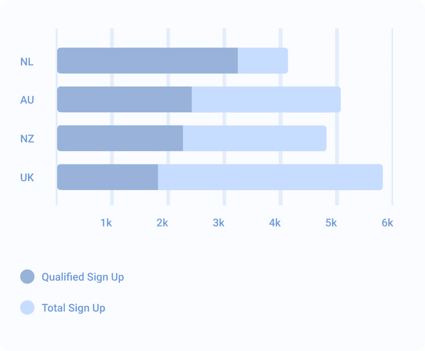
Data Analytics
Combining the data for 3 different analytics tools for the 4 countries, we saw the less gap between visits and qualified application was the Dutch website that was following some of the best ux practices. We chose it as a reference for creating our blueprint.

Solution
New Architecture
Following the best practices and the previous competitor analysis, we reorganized the navigation for header and footer to standardize and simplify the navigation. We improved the internal hyperlinking and corrected visual inconsistency (e.g. icon meaning, define alt tag for images).

Digestible content
Based on the disclosure principle, we divided the Walkthrough video in three 3 parts and added accordions on the bottom the most descriptive product page to satisfy at the same time SEO requirements.
Calculator only on the pricing page
Heat maps and recording revealed users were not scrolling down a certain area (e.g. Calculator). We decided to move the calculator on secondary product pages. In addition we assumed that visiting the sign up form without enough information and context would lead to an elevated bunch rate of the page.

Measuring impact
After the report and the agreement with Heads of Marketing of each country, we presented the new product pages and website navigation making use of the new design system (described in the other case study).
KPIs we defined and we improved at the start of the project:
1. Increase the traffic to the Sign Up pages (+4%)
2. Reduce bounce rate of Sign Up pages (-30%)
3. Increase the number of qualified applications (+5%)
4. Reduce avg. bounce rate of product pages (-14%)
5. Increase timing on product pages. (+6s)


Learnings
Patterns
Designers can understand user behavior and preferences, enabling them to create more user-centric and effective designs. In addition, you can uncover unforeseen outcomes, and correct them if necessary.
Data Analytics
Consulting specialized teammates can help you understand your data better. Indeed it is very easy to misinterpret data, if you do not take careful distance from your bias and stakeholder influences.